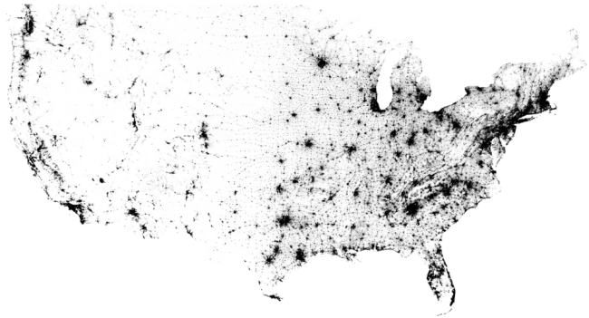
Where Everybody Lives (Black dots and areas represent where residents are populated in the U.S.)
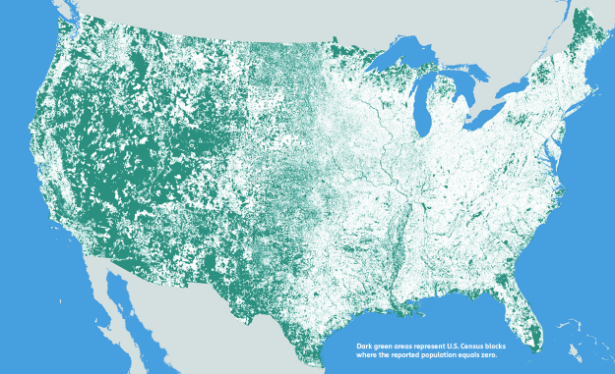
Where Nobody Lives (Green dots or areas represent where residents are populated in the U.S.)
This set of data visualization can be both a positive and a negative lesson we can learn from.
Indeed, the methodology of using block-data to map out from a huge sets of data the U.S. census provided is both creative and concise. The most important thing we should learn from this map is that “big” data can be “small”, and it depends on how you choose to plot data. I assume some other graphic artists might considering using raw data instead of turning it to blocks before mapping out the whole image.
Even though I have to admit that the topic is relevant to almost everyone, and the visual impression is strong, it confuses me at the first sight with its color contrast.
Considering this scenario. You open a magazine and turn to a random page with this map (second map) flowing on the page, would you be more inclined to think of the green area to be populated or the blank area? I believe most people would vote for the blank area, since it’s a traditional way, and “historical” way to visualize the data “zero.” However, the MIT Media Lab chooses green to indicate where nobody lives, which can make a little sense since they might want readers to focus more on the green than the blank. Still, the message is confusing for common readers’ hunch, so I don’t think it’s a successful example of data visualization.


